The room that borrows its palette from a bowl
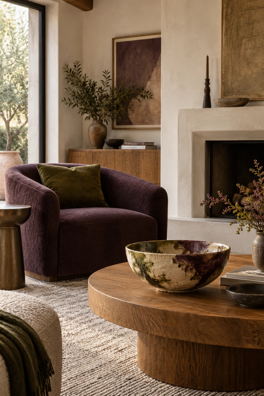
myAudience · AI-generated interior illustration · Original generated illustration; not documentary evidence
A favourite bowl can be a better starting point than a paint chart. Its glaze already contains a small conversation between colours: perhaps cream, moss and a dark plum edge. You do not have to copy all of them at the same strength.
Put the object beside the things that must stay. The floor, sofa and curtains are the real context. Choose the quietest colour in the bowl for the largest surface you are considering, then keep the stronger notes for things that occupy less space. A plum cushion can answer a plum rim without asking for a plum sofa.
Try three existing objects before ordering samples: a cream cloth over the armchair, a green book on the table, a dark wooden frame nearby. Stand at the doorway. Which combination looks intentional, and which feels like several unrelated purchases? Photographing it can help you notice where a bright colour overwhelms everything else.
Materials matter as much as pigment. A glossy green glaze and a matte green textile will not look identical, which is part of their charm. The aim is a family resemblance rather than a colour-matching exercise.
If the bowl itself is fragile, give it a secure position where it can be enjoyed without being knocked. Let the rest of the room borrow its colours quietly. The most personal palette may already be sitting in a cupboard.