Olive green beyond the feature wall
myAudience · AI-generated interior illustration · Original generated illustration; not documentary evidence
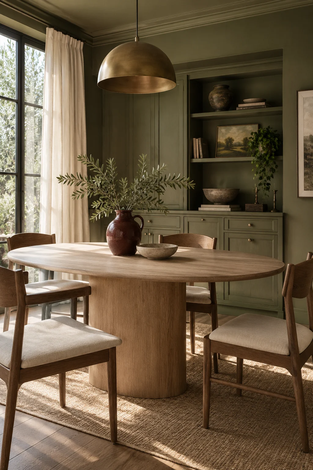
Olive can do something more interesting than occupy one emphatic wall. Let it appear in several related forms and the colour begins to feel like part of the room's fabric.
Choose one main olive and one supporting variation: a painted cabinet and a slightly lighter textile, perhaps. Keep their difference visible. Almost-matching greens can look accidental when placed side by side; a clearly softer or darker shade gives each a role.
Against these, try pale timber and cream rather than adding another forceful wall colour. A small red-brown jug or terracotta bowl can supply the note that keeps the scheme from feeling uniform. Move that accent around before adding another one. Sometimes a single object is enough.
If painting is part of the plan, test the chosen finish on suitable sample boards and examine it where the cabinet or wall will actually be. Follow the coating instructions and surface preparation requirements; a sample is a colour decision, not proof that paint will adhere to every material.
In a dining room, consider what happens when food and flowers arrive. The room does not need to provide all the visual interest before the table is set. Olive can be the patient background that lets a lemon, a loaf and an ordinary white plate look unexpectedly good.