Stripes without the seaside costume
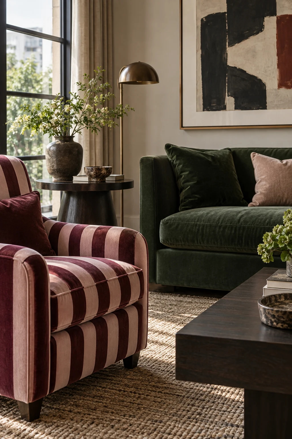
myAudience · AI-generated interior illustration · Original generated illustration; not documentary evidence
Stripes have a useful directness. They give a chair or cushion a rhythm you can see from the doorway. They do not need anchors, shells or a room painted entirely blue.
Try a colour pairing that belongs to your existing home: burgundy and pink, olive and cream, chocolate and oat. Keep the first striped piece near a plain surface. A patterned armchair beside a solid sofa lets the stripe show its shape without competing with another large motif.
Scale changes the effect. A wide stripe is a bold graphic gesture; a very fine one may read almost as texture at a distance. Drape a reasonably sized sample over the actual chair before choosing. A tiny cutting can hide the repeat that will dominate the upholstery.
Notice the direction without assuming it will magically change the room's dimensions. Vertical stripes and horizontal stripes create different visual movements; the useful question is which one suits the shape of this piece and the way you see it.
Let one other element answer the stripe's colour, perhaps a book cover or plain cushion. Then leave some surfaces unpatterned. The room should still have places for the eye to rest. A confident striped chair often needs fewer supporting accessories than you expect.