Pattern at three different scales
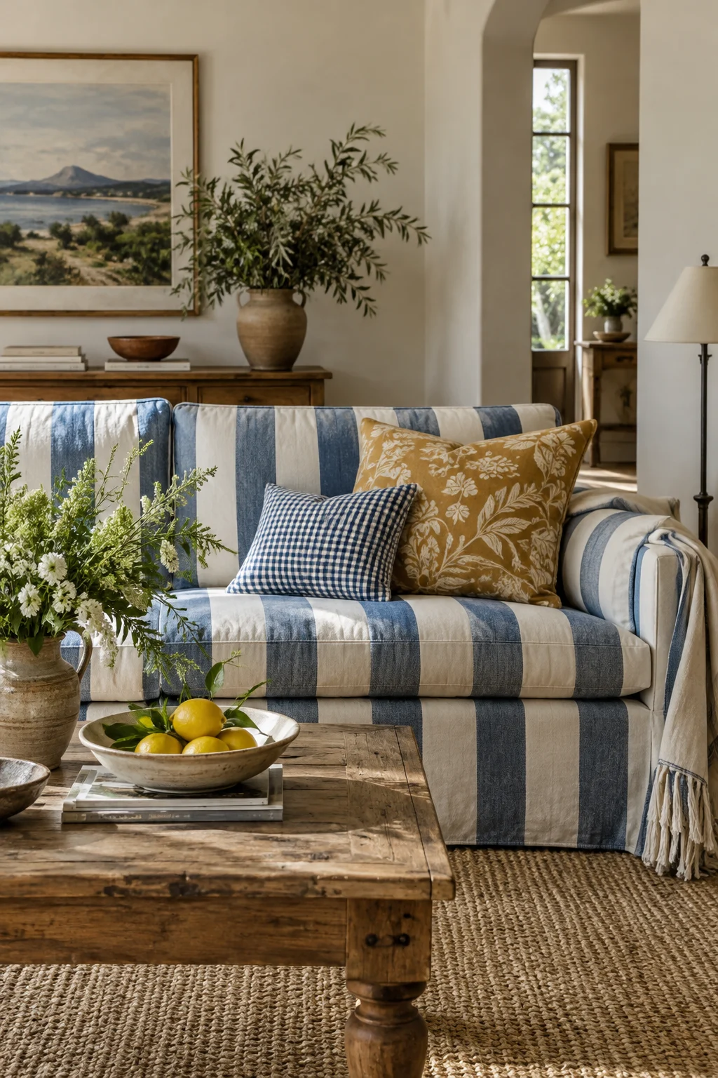
myAudience · AI-generated interior illustration · Original generated illustration; not documentary evidence
Patterns can live together when they are doing different jobs. A broad stripe, a medium botanical and a tiny check are easier to distinguish than three similarly sized prints all asking to be the main event.
Choose your largest pattern first and decide where it belongs. On a sofa it will occupy much more of the room than it would on a cushion. Place the second pattern beside it in the actual light, then introduce the third at a smaller area. You may find two are enough.
Give the patterns a shared colour, but allow differences in tone and material. A blue stripe can connect with a blue detail in an ochre botanical without being an exact match. Plain fabric is the useful fourth participant: it gives the other three their outlines.
Look from across the room, then close up. At a distance, the broad structure should still make sense. Nearby, the small print can offer the detail. Photograph the arrangement without a filter if that helps, while remembering that a camera changes colours.
Before buying, remove one patterned object already in the room and see whether the new grouping has room to breathe. Pattern mixing is not an instruction to accumulate. Sometimes the most lively composition comes from adding one thing and putting two others away.