Choose Contrast Around the Plate
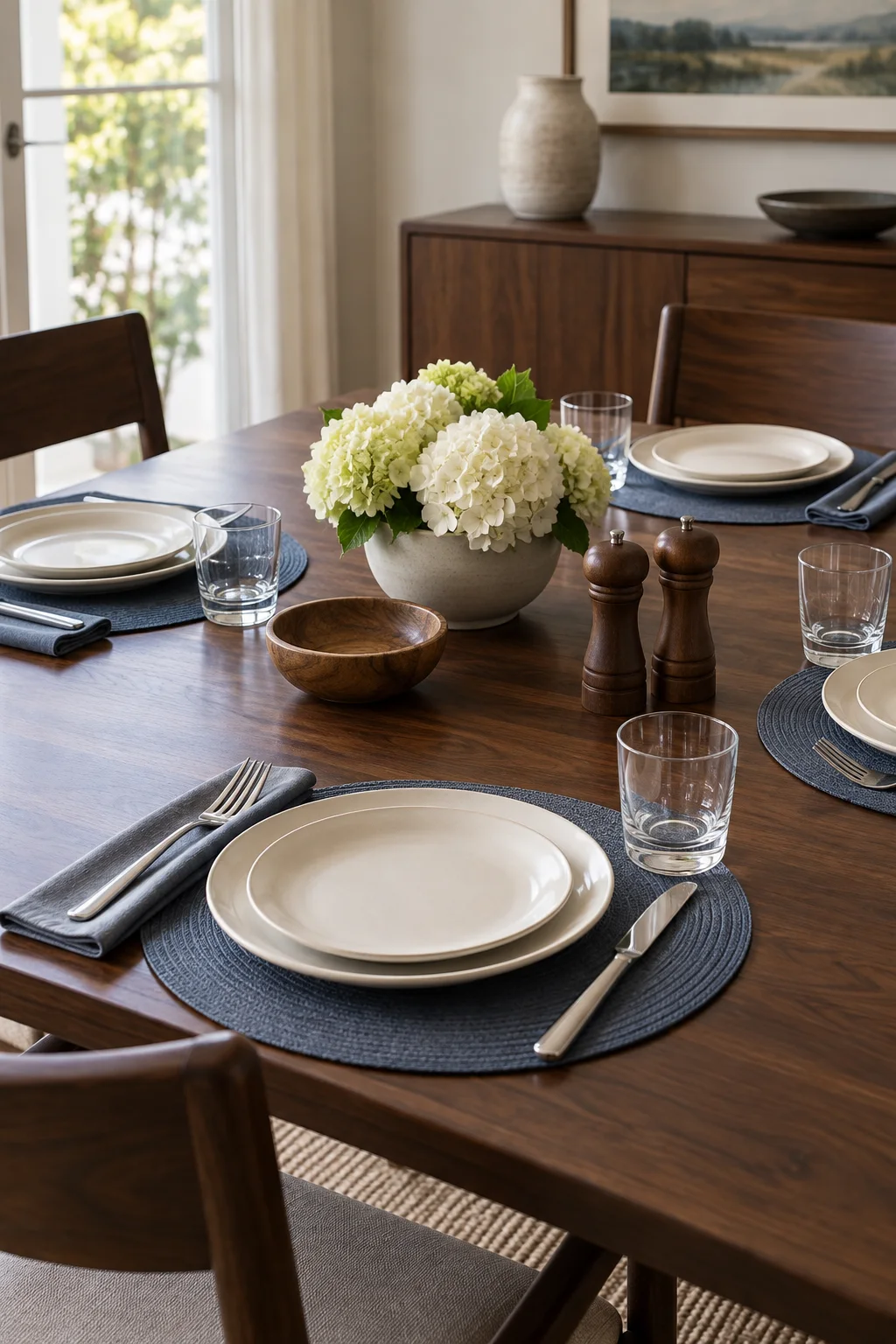
AI-generated editorial illustration for myAudience · Generated for myAudience; not a photograph of a real home or event
A place setting should be easy to read as well as pleasing to look at. A pale plate on a muted blue mat gives this dark table a useful outline. Check the actual light and ask what works for guests whose vision or reach differs from your own.
Avoid adding several patterns directly beneath utensils and glasses. Sit at the table to see the rim, handles and surrounding space from the diner’s position. A striking overhead photograph does not tell you how convenient the setting feels in use.
Emily Post’s table guides offer familiar relationships between the pieces, which can be adapted for individual comfort. The contrast choices here are original editorial suggestions rather than a claim that one palette suits everyone. Keep the meal’s necessary items visible and reachable.
Use ordinary sound tableware and check lighting without glare. Leave comfortable routes around the chairs. A clear visual arrangement can still be warm and personal, with the walnut grain supplying texture and fewer objects competing for attention.